Pleasing user interface is not only good-looking – it’s profitable. The easier it is for a user to browse, choose, try on, and purchase something, the higher the conversion rate. This is especially important when using augmented reality (AR) features designed to impress customers and increase sales. To align with modern e-commerce UI expectations shaped by Google AI Overviews and general UX best practices, successful AR-driven stores should also follow broader principles such as mobile‑first layout, fast loading times, simplified navigation, trust‑building elements, and streamlined checkout flows. These fundamentals work in tandem with try‑on features to maximize conversions.
In this article, I will share some of the best practices for eCommerce UI design that our most successful clients use to achieve the highest conversions and customer satisfaction.
[navigation]
Tl;DR:
- AR brings up to 94% more conversions and up to 30% lower returns if the users know it is there and interact with it.
- Make the try-on button visible on the product page and main page.
- Place the “add to cart” button on the try-on screen.
- When a user starts a try-on session, the product should be applied immediately.
- Items available for virtual testing should be marked.
- Digitize as many products as you can.
Augmented reality in eCommerce
In online shopping, augmented reality mostly comes in the form of virtual try-on. Using this tool right could lead to massive improvements in add-to-cart rates and sales. For example, Boca Rosa made over $900.000 in revenue during the company’s 4-hour pre-release event that used AR try-on.
Beyond AR‑specific features, general e‑commerce UI elements such as clear product categories, intuitive filtering, and high-quality product images further boost user engagement. AR try‑on becomes even more effective when paired with organized navigation and strong product presentation.
Augmented reality can also bridge the gap between online and offline shopping. In-store smart mirrors can also provide the virtual try-on functionality – especially useful for products that can’t normally be tested en masse (e.g. cosmetics).
The most important thing is that AR eCommerce brings actual results – up to 94% better conversion rate, up to 30% lower returns, and up to 6 times better add-to-cart rate. So it is only natural that companies make an effort to make augmented reality features as accessible and intuitive as possible.
eCommerce UI best practices
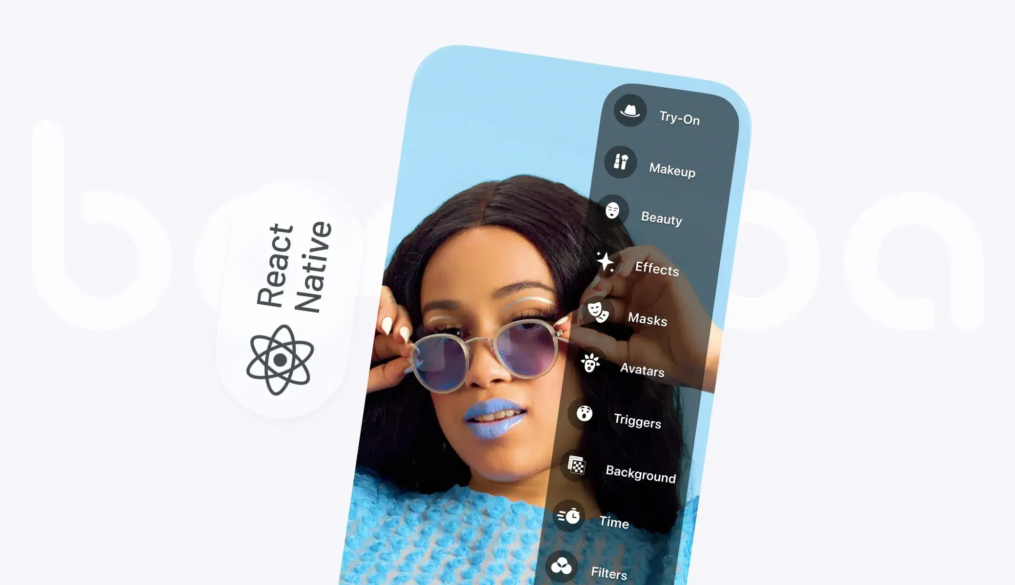
Let’s start with best practices for web-based applications (including mobile web). As examples, I will show you TINT – Banuba’s try-on platform for makeup, glasses, accessories, and more.
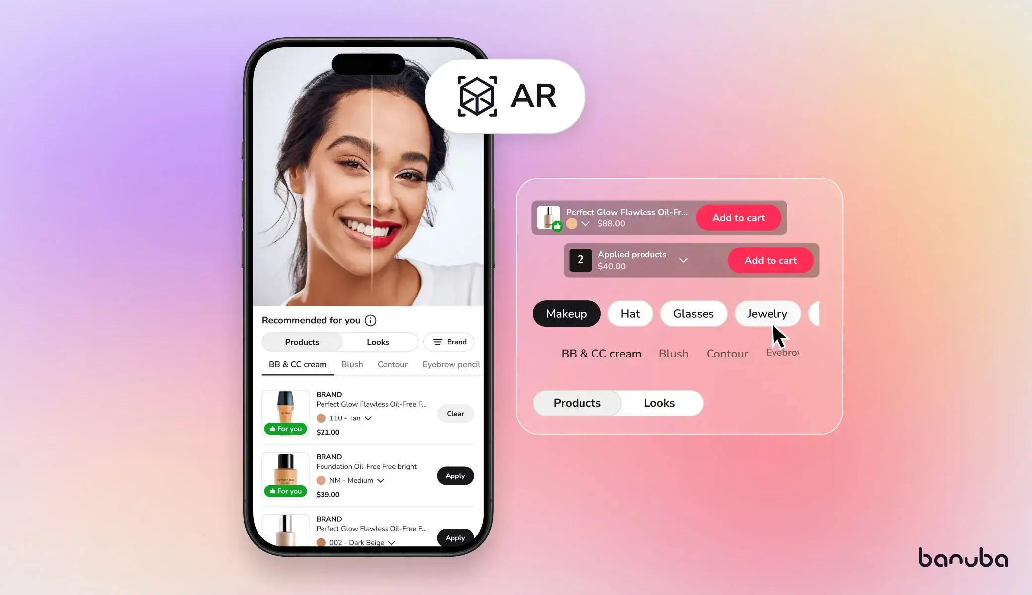
Visible try-on button on the product page
Your customer might not know that you even have virtual try-on. So your interface should tell them this. The appropriate button (“try now”, “try online”, whatever you want to call it) should be clearly visible and unambiguous. An icon of a mirror or a brush with the appropriate text and high contrast ratio (specifically 4:5:1) works well. Note that the try-on button shouldn’t overshadow the most important one – “Add to cart.”
The user also shouldn’t scroll to reach the button. The best practice is to put it no further than 650 px from the top of the screen.
 Try-on button in Oceane's online store
Additionally, ensure the button is optimized for mobile screens. A mobile‑first placement strategy keeps the try‑on CTA immediately visible without requiring zooming or excessive scrolling.
Add-to-cart button on the try-on screen
The fewer steps the user has to take to purchase, the better. This is why you should place the “add-to-cart” button on the try-on screen where the user can easily spot it.

To further optimize conversions, pair the add‑to‑cart action with concise product details (e.g., price, size options, key specs) displayed near the button. Clear, scannable bullet points improve usability and reduce hesitation.
Immediate try-on
Once the user clicks on the “try-on button,” the product should be applied at once. Augmented reality for eCommerce needs to be visible, don't make people take any additional actions.
 Eyelashes are immediately applied
Try-on button on the home page and in the footer
Showing that users can test the products on your website/in your app entices people to do exactly that.
You can also place a try-on button in the footer, so it is always visible and accessible.

Homepage hero sections can further highlight try‑on capabilities through high‑quality visuals and short, action‑oriented CTAs. These micro‑optimizations align with general e‑commerce best practices and improve engagement.
“Available for try-on” tag
Every product available for testing should have the corresponding tag on its card in the catalog. This way prospective customers will immediately be directed to the corresponding products

This tag can be supported with user ratings, reviews, and trust badges. Showing social proof near try‑on‑enabled items increases confidence and improves click‑through rates.
Limit the user’s choice
On the surface, more options might seem like a good thing. In practice, however, the overabundance of choices leads to analysis paralysis where people keep trying on various items without actually buying anything.
Simply denying certain options would not be user-friendly. So the best approach would be a recommendation system that suggests the products that would fit the user. The recommended items are more likely to be added to the cart and purchased.
 Recommendation system highlights the most fitting products
Personalized recommendations based on user behavior, past purchases, or browsing patterns improve decision-making efficiency. This aligns with broader personalization trends in e‑commerce UI and enhances add‑to‑cart rates.
Digitize as many products as you can
This is not exactly an app interface design thing, but it’s still important to gain the most out of your virtual try-on. Each digitized product is an opportunity for your visitor to become customer. So the more items you have available and the more try-on sessions happen, the higher your sales will be.
Making digital copies of cosmetics and eyewear, for example, is cheap, but brings high returns.
Ensure digitized products load quickly by optimizing 3D assets and images. Compressed, efficient textures reduce load times—one of the most important general UI principles for preventing abandonment.
Additional General eCommerce UI Best Practices
Mobile-first design
Most users shop on mobile, so ensure layouts, CTAs, and try‑on experiences are fully optimized for smaller screens.
Fast loading and performance
Optimize images, videos, AR textures, and background processes to maintain fast load speeds.
High-quality product presentation
Use professional photos, videos, and clear bullet‑point descriptions to increase user confidence.
Trust and security signals
Show security badges, clear returns policies, and visible customer support options.
User reviews and social proof
Display product ratings, testimonials, and visual user-generated content when possible.
Streamlined checkout
Minimize steps, reduce form fields, and offer multiple payment options.
Always‑on support
Provide live chat, searchable FAQ sections, or a chatbot to answer questions instantly.
Conclusion
With the right application, augmented reality can bring a higher add-to-cart rate and sales. However, it needs to use solid AR eCommerce design patterns and best practices to achieve its full potential. By following the guide above, you can make sure that your visitors will see the unique features and convert to customers.
And if you want a ready-made try-on platform with all these practices already in place, schedule a demo for TINT.

-
AR in eCommerce usually refers to augmented reality features that online stores have. The most common of them is virtual try-on, letting people virtually test products before purchasing.
-
Yes, augmented reality reduces e-commerce return rates. Virtual try-on helps people select the products that would fit, so there would be no reason to send them back. As a result, buyers keep their purchases in up to 60% more cases.
-
The most common application of augmented reality for e-commerce is virtual try-on - a feature that lets shoppers remotely check how various items (cosmetics, accessories, eyewear, etc.) will look. It is convenient for buyers and effective for businesses, increasing sales by up to 300% and decreasing returns by up to 60%.